James Baduor
Design
Share this article
James Baduor
Design
Share this article
Mintlify's dashboard redesign focuses on creating delightful user experiences inspired by industry leaders like Linear and Vercel, featuring a complete design system overhaul with improved navigation, progressive disclosure, and enhanced authentication options. The redesign addresses customer pain points while maintaining simplicity and usability, with plans for additional customization features including color themes and component improvements.
At Mintlify, we understand that design goes beyond aesthetics; it's about creating experiences that delight and empower users. Industry leaders like Linear, Vercel, Airbnb, and Apple have set a high standard, demonstrating that exceptional design is not merely a bonus but a critical factor in achieving success.
Airbnb's design-centric approach has revolutionized the way people travel and find accommodations, while Apple's iconic products have transformed entire industries. Inspired by their examples, Mintlify is committed to placing design at the heart of every decision and every feature we develop.
We strive to deliver a product that not only looks beautiful but also functions seamlessly, providing users with an unparalleled experience.
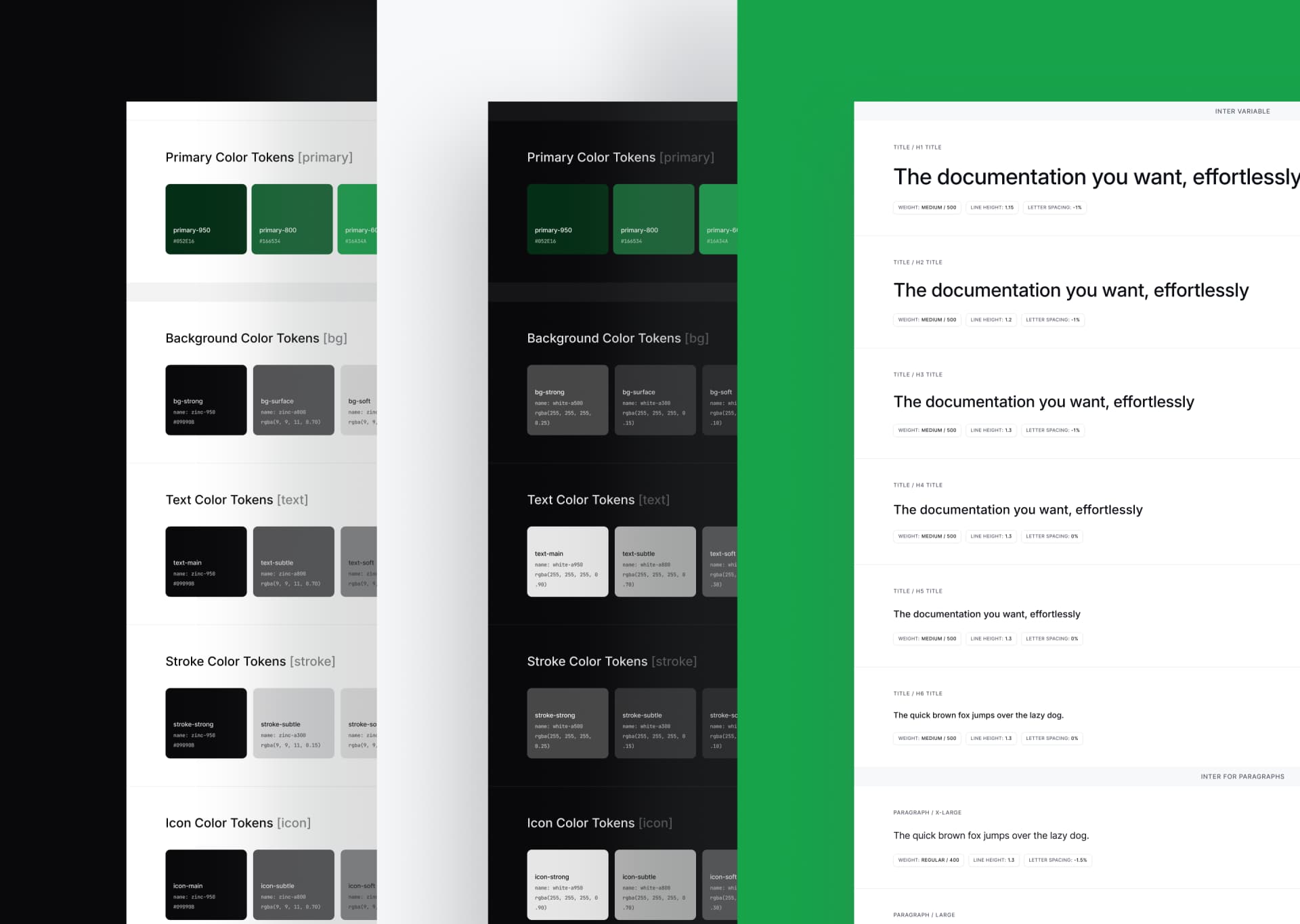
Overhaul of Our Design System
Inspired by the clean and modern looks of products like Vercel and Resend, we decided to completely redo our design system. We carefully updated our colors, spacing, fonts, and icons to create an interface that looks great and works well together. By following the guidelines of Radix UI and Tailwind CSS, we made sure the user experience is consistent and easy to understand across our entire platform. Now, our design has a fresh, simplified style that makes it better to use and nicer to look at.
As the saying goes, "Design is not just what it looks like and feels like. Design is how it works." And we couldn't agree more.

Addressing Customer Pain Points
At the core of our redesign efforts was the valuable feedback we received from our incredible customers. One particular area of concern was the magic link authentication process. To address this, we're implementing additional authentication methods that will provide users with more flexibility and ensuring a secure experience. Additionally, we're completely revamping the user onboarding process to make it more intuitive and user-friendly.
The redesigned settings page makes it easier for users to manage their Github app connections, domains, and team invitations. With a focus on simplicity and usability, the updated settings now provide a more intuitive and efficient experience. Users will find that configuring their preferences and making changes is a straightforward process, saving them time and effort.

Effortless Navigation
Have you ever found yourself lost in a sea of buttons and menus, wondering where to click next? We've all been there. That's why we made navigation a top priority in our dashboard redesign. With intuitive and streamlined navigation, users can now effortlessly switch between organizations and deployments, thanks to the addition of quick access buttons.
We also sprinkled in convenient links to our documentation, support, and access management. No more endless clicking or frustrating dead-ends!

Progressive Disclosure as a Balancing Act
Information overload is a real struggle, and we've all experienced the overwhelming feeling of being bombarded with too much data at once. To combat this, we employed the principle of progressive disclosure in our redesigned activity page. By presenting users with the right information at the right time and offering the ability to explore further when needed, we strike a perfect balance between clarity and depth using simpler actions and components.
Our users can now make informed decisions about their deployment activities without feeling like they're drowning in a sea of charts and numbers.

The Future is Customization
Soon, we'll be rolling out even more customization options for our public-facing docs. Our customers will have the power to tailor their documentation to their specific needs and preferences, with features like color customization, component improvements, and a selection of multiple themes.
We understand that every company is unique, and we're committed to providing a flexible and adaptable documentation solution that caters to diverse requirements.

We believe that design is an ever-evolving process, and we're always on the lookout for ways to refine and innovate. We'll continue to listen to our customers, iterate on our designs, and push the boundaries of what's possible in documentation management.
More blog posts to read
How Claude Code's documentation team makes feedback actionable with Mintlify
Anthropic's Technical Content Engineer for Claude Code shares how she uses Mintlify and Claude to automate documentation improvements from user feedback.
June 25, 2026Ethan Palm
Technical Writing
Docs as an abstraction layer for coding agents
A large engineering org ran controlled experiments to measure how structured Mintlify docs affect agent performance on massive codebases. The results: 64% more precise, 39% more discoverable, half the tokens, 1.5x faster.
June 8, 2026Han Wang
Co-Founder