Han Wang
Co-Founder
Share this article
Han Wang
Co-Founder
Share this article
Mintlify's design philosophy centers on three core principles: creating "invisible" design that feels natural and seamless, treating developers as users who deserve great experiences, and being opinionated by default while remaining infinitely flexible when needed. The team achieves this through rapid iteration, close collaboration between designers and developers, and relentless attention to detail that makes documentation something developers can be proud of.
When we ask our users why they moved to Mintlify, it's often because of the user experience of our documentation. It's something that we are always thinking about, and that we devote countless hours and iterations to.
So what exactly makes good design? When you really boil it down, good design is all about taste.

Good taste is not innate. It's born from experience. It requires time, practice, and relentless energy to build. There is no formula for getting there other than putting in the hours.
Even more frustratingly, our skill or ability to execute may often fall short of the level of taste we've developed. While a good designer can tell you why a product looks great and why it feels right, a great designer can actually execute and achieve that level of design.
For the Mintlify team, achieving parity between our skills and our taste in design means countless iterations and many hours. Even when we think we've nailed it, we know that it is still very much a work-in-progress. There will always be something we can improve.
Our Principles

Our approach towards design heavily prioritizes principles over process. As an earlier stage startup, speed and agility are crucial, and our approach to design reflects that.
Rather than following a longer, systematic, and usually single-flow process, which is necessary for many large companies, we design through rapid iteration. Out of pragmatism, our design process is meant to be simple, free-form, and lean, so that we can test and improve solutions as quickly as possible.
Throughout any design project at Mintlify, our designers and developers work closely and are expected to adopt an understanding of how the other thinks. Both contribute equally at a higher level and offer their specialized expertise, such as crafting user interface elements or implementing APIs, to complement each other's skill sets.
This approach enables our design process to be iterative and dynamic while staying true to our three key principles in design:
Great design just feels right

Design is never an end goal in and of itself. Its purpose is to help facilitate an action—it helps the user complete a task they might not have been able to do and complete it well.
As a result, great design is not something that the user should have to consciously think about. It should feel natural, seamless, and—ideally—act like an extension of their minds.
Examples where this philosophy of “invisible” design is done really well include Notion and Apple's iOS updates. In both cases, the design is non-obstructive for the user, it's intuitive, and it guides the user through its components without explicitly drawing attention to its design.
In this sense, experiencing great design is like running your hand along a smooth surface. Users shouldn't really notice it when it's there, but if the design is executed poorly and bumps appear on the surface, then the user will definitely notice.
The goal is to achieve this magical “unnoticeable” moment. Once you find that magical moment, it becomes an element of your overall design that is no longer drastically changed. While the details of it may be iterated over time, the fundamentals of that element are kept the same, because it just feels right for everyone involved—the developers, designers, and users.
I once asked Guillermo Rauch about Vercel's experience achieving that magical moment for their onboarding process. Their onboarding had evolved to a point where it was simple, quick, and their team and users agreed that it just felt right. As a result, that part of the product would no longer really be iterated on moving forward.
That's it. They found that moment, trusted it, and stuck with it.

During our journey designing Mintlify, reaching the magical moment has meant referencing our personal experience as users of our own product and going through countless rounds of iteration, both in code and in Figma.
Almost every corner of Mintlify has been iterated at least 2 to 3 times, covering details from layout, to color, to the way a component looks. The API Playground took about 150 versions in Figma before our team finally landed on the version we have today. It is a version that we are proud of, and that is now a core part of our product.
All this is to say, trust the process. Give it enough time and thought and iterations, and you will find that magical moment.
Developers are users too
There is a common misconception that developers don't care about design. While developers do have a much higher tolerance for bad design due to a technical and highly task-driven background (if it works, it works), that does not mean that developers are happy with the experience.
Developers, just like all other users, are still trying to achieve an end goal with that product, and the process of getting there matters to them, too. As a developer-focused company, Mintlify's philosophy is to make their experiences magical through great design.
This is a philosophy that Hahnbee and I picked up from our past experience building many products together (many of which did not live to see the light of day) that eventually inspired us to start Mintlify in the first place.
Even back then, we were always building developer products, which required documentation to communicate what we were doing to users. As part of developing our product, we scoped out much of what our competitors were creating, including looking at their documentation.
We were surprised to find that design and developer experience did not seem to lie at the heart of much of their documentation. When it came to building Mintlify, we wanted to create something that would provide both—by caring about developers and design.
How? By delivering documentation that developers can be proud of.
Regardless of whether our users are familiar with design, Mintlify enables them to build a beautiful frontend experience for a generally backend product in very little time. From our navigation structure, to our AI Suggestions, to our API Playground, we allow users to hit the ground running when it comes to building an experience they can stand behind.
In other words, we make developers proud of their documentation through great design, because yes, they do care about design.
And so do we.
Opinionated when you're lazy. Infinitely flexible when you need it to be.

This is a principle that has stuck with us since the very beginning. It is our slogan, our magnum opus. It points to Mintlify's immense range of capability for supporting our customers.
We want to help our users build their ideal documentation with minimal time and effort by making as many reasonable assumptions as possible—from the layout, to how search should look, to how the KPIs should be set up. At the same time, if our users want to customize their documentation and really make it their own, then we give them all the tools to achieve that as well.
As a developer-focused product, Mintlify offers both ends of the spectrum based on how much users would like us to exert our opinion on their documentation and how much time they'd like to spend building it.
Some customers take no more than five minutes setting up their documentation. Others might want to go the extra mile and spend up to a week, if not even longer, to achieve their ideal finished product. (For example, we love what Flatfile did.)
In every aspect of our design, we make sure to offer options, so that users have the freedom to choose the degree of customization they are most comfortable with.

Closing thoughts: What is your approach to design?
As a team, we put great emphasis on listening to our user feedback and taking it back to the drawing board. We brainstorm, we test, we iterate, until eventually we reach a solution which puts our users back in that magical moment.
What do you think makes great design? What is your approach to design? Let me know on X (Twitter).
More blog posts to read
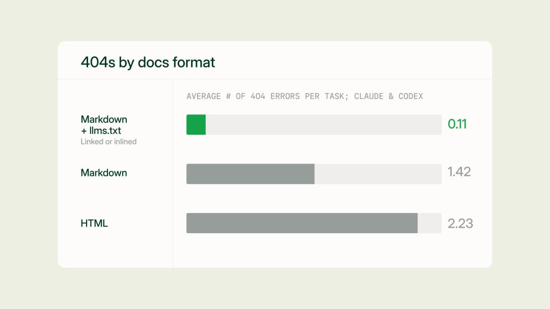
Docs URL Benchmark: Markdown & llms.txt > HTML
We benchmarked four ways to serve documentation to AI agents (HTML, plain markdown, markdown linking to llms.txt, and markdown with llms.txt inlined) across 2,400 runs on 20 Mintlify docs sites, and found that a single link to llms.txt eliminates most agent 404s at no added cost.
July 17, 2026Aadit Shah
Engineering
How Claude Code's documentation team makes feedback actionable with Mintlify
Anthropic's Technical Content Engineer for Claude Code shares how she uses Mintlify and Claude to automate documentation improvements from user feedback.
June 25, 2026Ethan Palm
Technical Writing