James Baduor
Design
Share this article
James Baduor
Design
Share this article
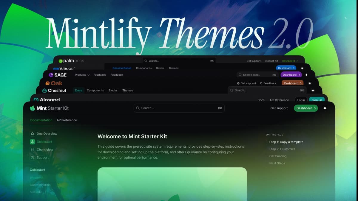
Mintlify's Themes 2.0 introduces a comprehensive design system with 10 industry-specific themes (Mint, Maple, Palm, Linden, Willow, Sage, Oak, Chestnut, Kernel, Almond) built for different documentation needs. The new system integrates with docs.json schema to provide granular control over navigation patterns and component variations, moving beyond simple styling to offer true design system flexibility for teams across various industries.
At Mintlify, we've always believed that great documentation should feel like a natural extension of a company's product experience. Today, we're taking that vision further with a complete reimagining of our theming system.
Overhauling documentation themes isn't just about improving aesthetics—it's about addressing real customer pain points and adapting to developer expectations for technical content.
Customers needed more than one-size-fits-all
Our initial themes provided a solid foundation, but we noticed a recurring challenge: teams were spending countless hours customizing their docs to fit their needs, often hacking together CSS overrides or even building full design systems from scratch.
What began as ad hoc feature requests revealed a deeper pattern: different industries have fundamentally different documentation needs.
A one-size-fits-all approach was forcing teams to either compromise on their documentation vision or invest in significant workarounds. Some of our largest customers were maintaining extensive custom design systems on top of Mintlify, while others were piecing together multiple tools to create specialized layouts.
It became clear that developers needed more than just pre-built themes—they needed a flexible foundation that could adapt and grow alongside their documentation.
A system for every use case
Instead of just adding new templates, we built Themes 2.0 as a comprehensive design system tailored to different industry needs—from the minimalist Willow to the enterprise-focused Palm.
The real power comes from how these themes integrate with our new docs.json schema. Our previous mint.json setup was a flat configuration that limited flexibility, but docs.json introduces a more intuitive nested structure that gives teams greater control.
Want to create industry-specific navigation patterns? You can now configure unique navigation hierarchies without touching CSS. Need custom component variations for different types of content? You can now define reusable component presets that maintain consistency across your documentation.
This shift moves beyond simple styling tweaks. Think of it as a true design system: themes provide strong opinions and defaults for different use cases, while docs.json gives you granular control to fine-tune them—without fighting the system.
10 themes, built with your industry in mind
This month, we're launching 10 new themes, each designed for different documentation styles and industries:
- Mint — Classic Mintlify documentation theme with time-tested layouts and familiar navigation. Perfect for teams that want a proven, professional documentation experience.
- Maple — Modern, clean aesthetics perfect for AI and SaaS products. Balances sophisticated functionality with approachable documentation through thoughtful white space and contemporary design elements.
- Palm — Sophisticated fintech theme with deep customization for enterprise documentation. Features structured information hierarchies and robust component systems for complex technical content.
- Linden — Vintage minimalism meets modern documentation needs. Brings a unique aesthetic to technical documentation without sacrificing functionality.
- Willow — Stripped-back essentials for distraction-free documentation. Removes unnecessary visual noise to keep focus where it matters - on your content.
- Sage — Bold, contemporary design for next-generation SaaS platforms. Pushes documentation design forward while maintaining clarity and performance.
- Oak — Structured clarity that puts content organization first. Introduces intuitive navigation systems and clear visual hierarchies for managing large documentation sets.
- Chestnut — Content-first design with personality through boxed layouts and structured hierarchy. Makes complex documentation feel approachable and organized.
- Kernel — Expansive layout optimized for extensive documentation and rich content display. Built for platforms with large amounts of technical information.
- Almond — Card-based organization meets minimalist design for intuitive navigation. Uses visual cards and contextual navigation to help users find information naturally.
With Themes 2.0, documentation can feel tailored, not templated—giving teams the flexibility to scale their docs without unnecessary workarounds.
For a list of all available themes today, check out our docs.
Building the new standard
Themes 2.0 gives teams the flexibility to build documentation that feels native to their product—without the overhead of custom design work.
Whether you're optimizing for clarity, branding, or complex technical content, our new system makes it easy to adapt your documentation for your needs. We're committed to making documentation as effortless as possible—for every team, in every industry.
More blog posts to read
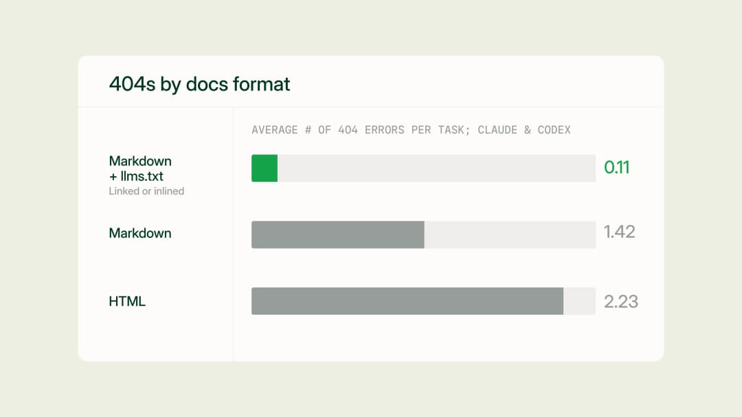
Docs URL Benchmark: Markdown & llms.txt > HTML
We benchmarked four ways to serve documentation to AI agents (HTML, plain markdown, markdown linking to llms.txt, and markdown with llms.txt inlined) across 2,400 runs on 20 Mintlify docs sites, and found that a single link to llms.txt eliminates most agent 404s at no added cost.
July 17, 2026Aadit Shah
Engineering

How Claude Code's documentation team makes feedback actionable with Mintlify
Anthropic's Technical Content Engineer for Claude Code shares how she uses Mintlify and Claude to automate documentation improvements from user feedback.
June 25, 2026Ethan Palm
Technical Writing